The Design of Etna
Etna’s development was inspired by historical models, but the typeface also takes many liberties to make it more usable in contemporary contexts.
Influences

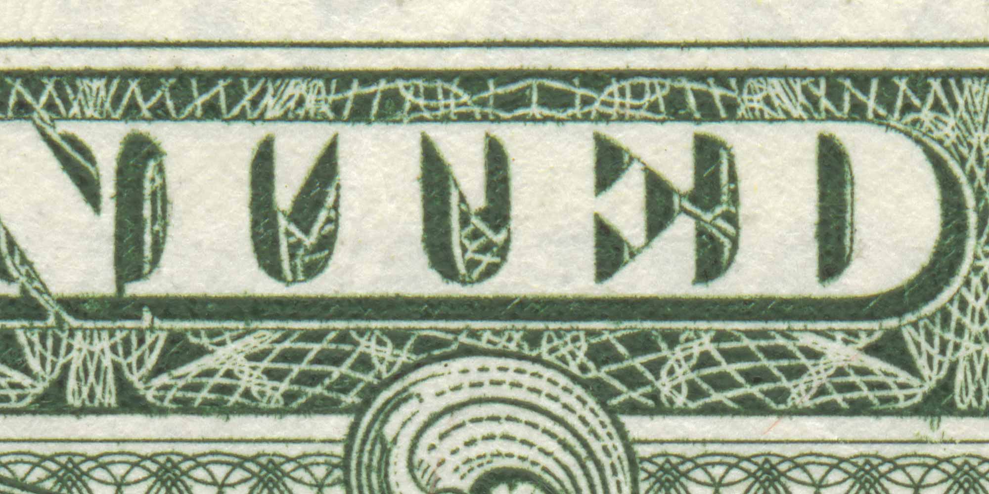
Detail of engraved lettering on a modern U.S. one dollar bill.
I don’t remember exactly when I first noticed it, but I’ve always liked the the style of engraved lettering used on U.S. currency. At first glance, it looks like a 19th century “fat face”. But it has some distinctive characteristics, such as the really deep brackets on the serifs and the triangular serifs on the arms of the E, F, L, and T.
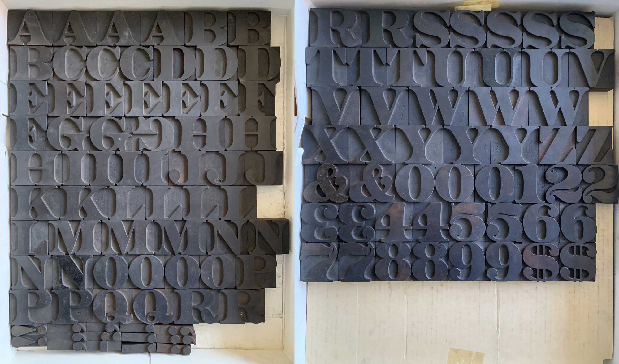
I learned that the style was called “Aetna” in the early eighties after I got a copy of Rob Roy Kelly’s book, American Wood Type: 1828-1900. The wood types in this style had another distinctive characteristic—beautiful foxtail terminals instead of ball terminals on lowercase letters.

Aetna letterforms as they existed in wood type, with triangular serifs and foxtail terminals.

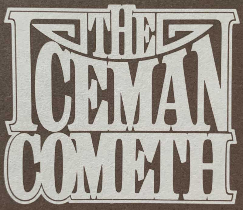
Design by Herb Lubalin using Aetna-style lettering for the 1973 film adaptation of The Iceman Cometh.
There are very few modern typefaces in this style, other than copies of the 1880s wood type, or faces made to look like the engraving on U.S. currency, complete with drop shadows, outlines, and shading. The Aetna style seemed to have fallen out of fashion after the late nineteenth century, except on U.S. currency. Herb Lubalin used a condensed version of it a few times. But that was about it.
It seemed to be a missed opportunity for some kind of revival, and the idea of doing it myself was in the back of my mind for a long time. I finally started working on it in 2009.
Design Traits
The style itself poses some technical challenges. Because the brackets on the serifs are so deep—going all the way to the middle of the stroke—it means that strokes that don’t have serifs look too thin, so I had to compensate by making them a little thicker.

There were some design elements in the original wood typefaces that caused problems, particularly the serifs. For some reason, they were unusually large. This looks great when you see an isolated character, but it makes it difficult to get nice, even spacing when setting words. You end up either allowing the serifs to overlap, or leaving unsightly gaps between letters.
Aetna also had some truly weird-looking characters. The lowercase f and t had bracketed(!) crossbars and some of the numerals are rather bizarre. For my version, I chose to reign in some of these quirks as they tend to call undo attention to themselves. In some cases, I just dialed it back, in other cases, I came up with a new design, but one that still retained the overall character.

Problematic or odd characters from wood type Aetna (top) compared with the corresponding forms in Etna.
My aim was not to make a straight revival, but to create a new typeface based on the underlying ideas of Aetna.
Expanding on the original

Aetna wood type at the Rob Roy Kelly American Wood Type Collection (image is reversed to be right-reading). Photo courtesy of David Shields.
Details varied in the original Aetna wood types from different sources. Some had ball terminals, and some had foxtail terminals. This was no contest—it had to be foxtail terminals. Second, some versions had what I would call “mansard” serifs—that is, serifs that are cut off at an angle rather than vertically. At first, I wanted to do the mansard style, but I felt that straight-cut serifs just worked better, especially for text.

Historical examples of Aetna with “mansard” style serifs.
All of the existing examples of Aetna were in the bold range. Since I wanted to do a complete range of weights, from Light to Black, so that meant reverse-engineering what lighter weights might have looked like, had they existed. This was one of the most exciting parts of designing Etna, and I was pleased to see how well it worked in lighter weights.

I wanted to make my design suitable for text, so that meant I had to come up with an italic style, something that Aetna never had. In keeping with the late-nineteenth century era the design came from, I generally tried to follow the path that Morris Fuller Benton took with his Century Schoolbook and Clearface italics.

The main push on Etna began in late 2017. By the end of 2018, I had designed a family of five weights with italics, with plans to release it in spring of 2019. But then I started thinking of doing some condensed styles.
The original Aetna had several different widths, going from normal to Extra-Extra Condensed (or XX condensed, as Rob Roy Kelly called it). At first, I thought I would do these later, as a separate release, but once I started working on them, I wanted them to be part of the initial release. I ended up doing three different condensed styles: Condensed, X Condensed, and XX Condensed. The X’s are a nod to Kelly, plus they take up less space in font menus.

The condensed styles are meant for display use. I recommend using them larger as they get more condensed. Think of the condensed styles as getting taller rather than narrower.
I plan to do wide styles as well, similar to what you see on U.S. currency. But I decided to hold off on these until later, or I would never get it released. Someday.
Finally, while getting ready to release Etna, I was working with designer Nick Sherman, who was building the website you are looking at right now. Nick asked if I had any plans to include dingbats—things like arrows and pointing hands. I hadn’t, but it was a great idea. I especially enjoyed designing the pointing hands—something I've never included in a font before.

Originally, I was going to call the typeface Aetna, just like the original. But there is already at least one typeface called Aetna (Hamilton Wood Type’s facsimile of the original distributed by P22). My design is a modern take on Aetna, so the modern spelling—Etna—turned out to be ideal.
All in all, I’m very happy with how Etna turned out. The normal width works great for text, and the condensed styles are beautiful for headlines.