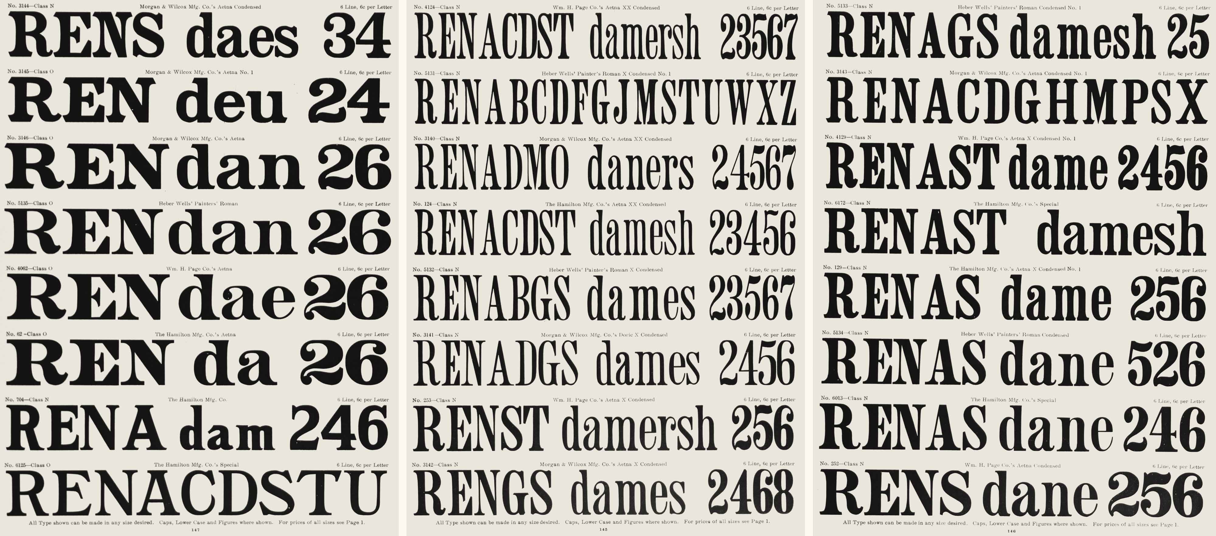
A variety of Aetna typefaces offered as wood printing type by Hamilton Mfg Co. in their 1906 catalog.
A History of ‘Aetna’ Typefaces
The historical Aetna style of typefaces that inspired Mark Simonson’s Etna type series has a unique history, with precursors in metal type and engraved lettering but solidifying as a distinct stylistic genre in the world of American wood type.
Pre-Aetna Fat Faces and Engraved Romans
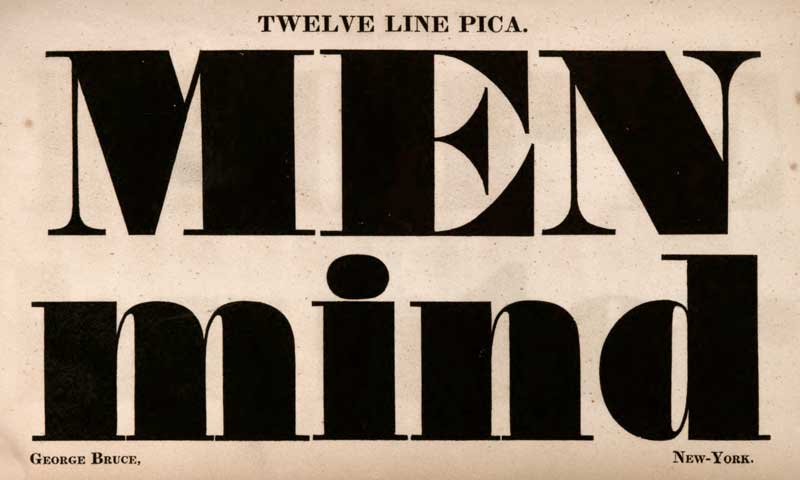
A fat face from George Bruce & Co., 1828.
The introduction of the fat face roman in the early nineteenth century heralded the advent of types designed specifically for display rather than for book work. The fat face roman would remain a dominant display style until the last quarter of the nineteenth century, but to meet the increased demands for poster printing more robust styles were developed by American wood type manufacturers. Modifications to the fat face roman first emerged as engraved and lithographed letterforms in the United States in the early 1860s, as can be seen on US banknotes at least as early as 1861.
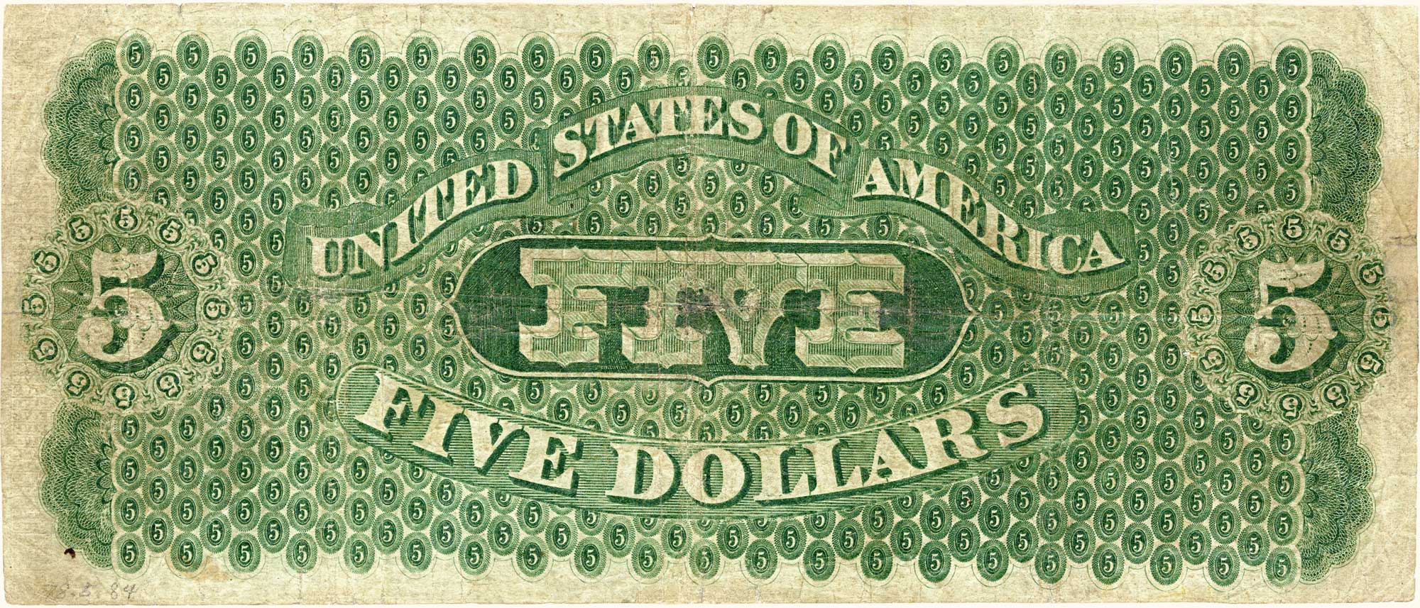
1861 US “greenback” demand note, showing a pre-Aetna engraved roman lettering style.
The drawing of these letterforms included a slight decrease in the contrast of light and heavy strokes by increasing the overall weight of the lightest strokes, an exaggerated bracketing of the serifs, and a gradual tapering of the stems.

Ornamented № 1,519 from George Bruce & Sons type foundry.

Rimmed Roman from the Farmer, Little & Co. type foundry.
Modifications to the fat face roman also began to appear typographically as outlined letterforms in the late 1860s, as seen in Bruce’s Extended Rimmed Ornamented (USD 2831, patented 19 November 1867) and Farmer, Little’s Rimmed Roman (USD 3070, patented 16 June 1868). The outline of these romans produced an overall sturdier contour through lowered contrast between light and heavy strokes. Both the engraved and typographic letterform patterns of the 1860s were direct influences on Wm H. Page & Co.’s Aetna¹ series.
The Official Birth of Aetna
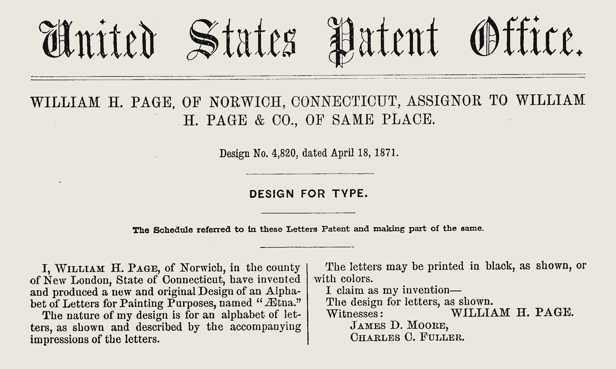
William H. Page’s 1871 patent for his Aetna typeface.
The Aetna type style originated as wood type in the U.S. and was patented by William H. Page and assigned to William H. Page & Co. as U.S. design patent № 4,820 on 18 April 1871. The face was first shown by William H. Page & Co. in James Conner’s Sons Typographic Messenger, Vol. 7 № 3 (July 1872). William Page described the distinctive aspects of the design in the U.S. design patent application as:
[…] nearly all of the straight parts of the letters are curved upon each side, being narrowest at their center, and gradually widen each way to the ceriphs, the curved side lines becoming sharper each way from the center till they form the inner lines of the ceriphs. These ceriphs are made small and have their ends beveled, converging outward, and all the terminations are also beveled in like manner.
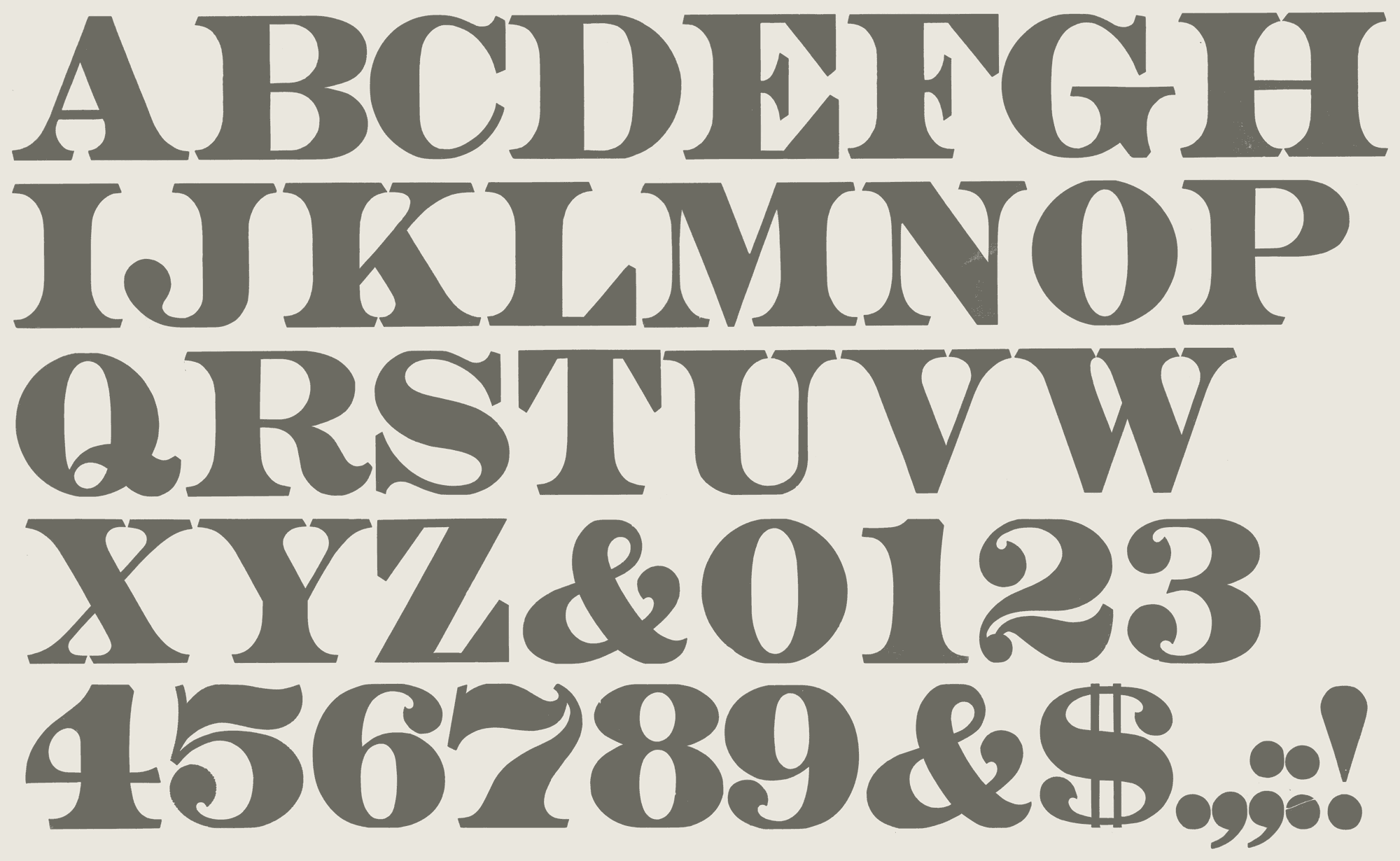
Aetna alphabet printed from wood type in the Rob Roy Kelly American Wood Type Collection.
In American Wood Type 1828–1900 Rob Roy Kelly described Aetna as an innovative reaction against the perceived fragility of the long popular fat face roman, and was developed to “withstand rough handling, be highly legible, and be heavy enough for display”.² Aetna had squared proportions with a slight reduction in stroke contrast in comparison to the fat face roman, and included the addition of exaggerated bracketing at the serif joint. The termination of the extended serifs were trapezoidal rather than rectangular, typically referred to as the Mansard³ or Detroit Serif⁴.
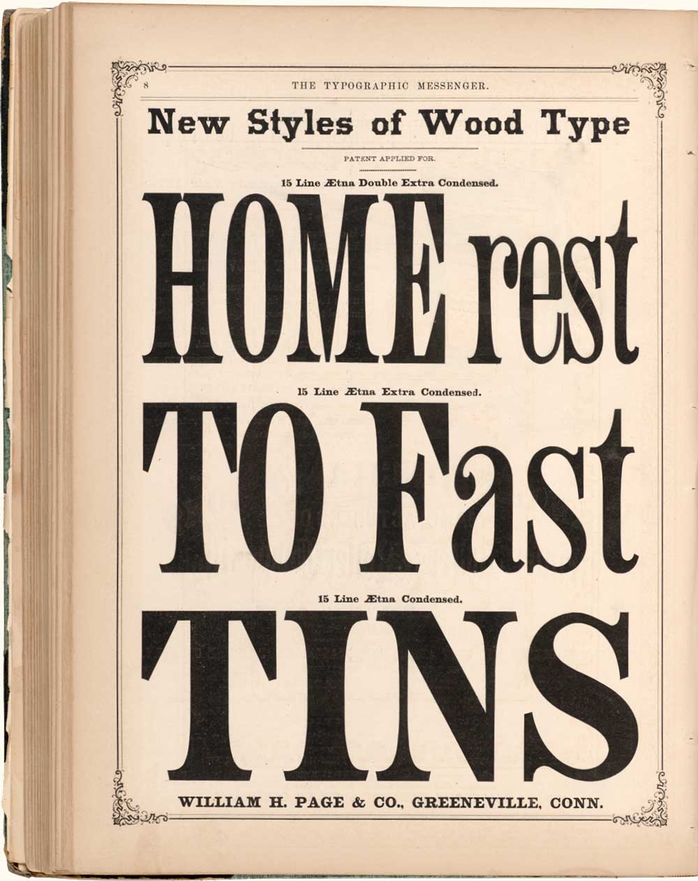
Condensed additions to Page’s Aetna wood type series as advertised in 1874 in The Typographic Messenger.
Expansion
Two years later Wm H. Page & Co. had developed and patented three stylistic variations of its original full face design. Patent applications were filed on 27 October 1873 and awarded on 23 December 1873 for Aetna Condensed (USD 7,074), Aetna X Condensed (USD 7,073), and Aetna XX Condensed (USD 7,072). Other American wood type manufacturers also offered this design after Wm Page & Co.’s introduction at least as early as the 1877 Specimens of Vanderburgh, Wells & Co.’s Wood Type, Borders, Rules, &c. The other American wood type manufacturers also used the names Doric and Painter’s Roman as alternatives to the name Aetna with very little variation to the original design. These designs were prominent in poster printing in the last quarter of the nineteenth century, but do not appear to ever have been adopted by the metal type foundries.

10-Line Streamer Aetna as shown in The Typographic Messenger in 1875.
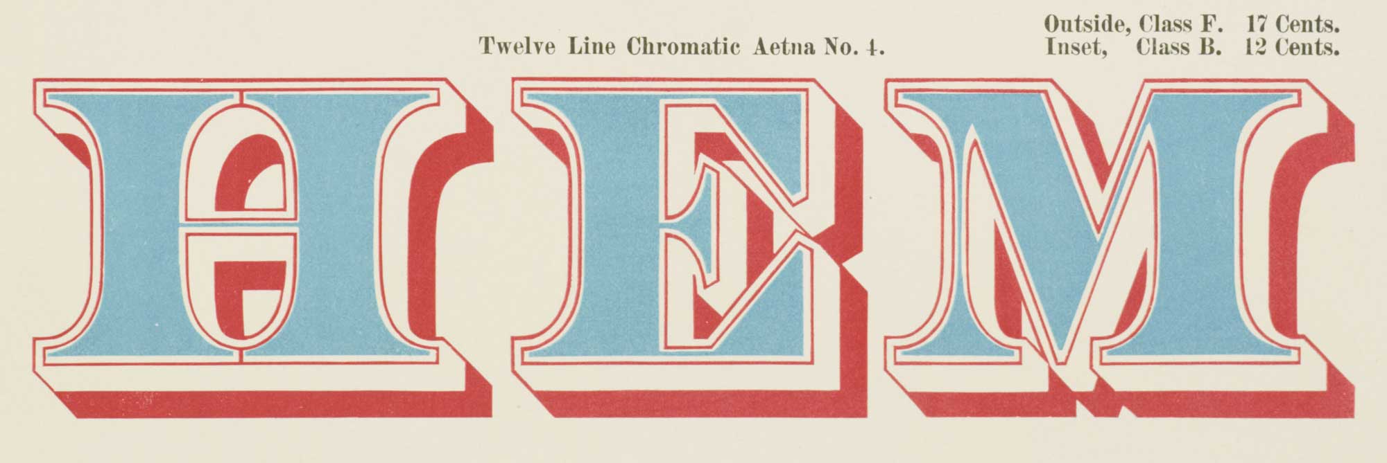
12-Line Chromatic Aetna № 4 as shown in Wm H. Page & Co.’s legendary 1874 chromatic specimen book.

12-Line № 107, an ornamented variation of Aetna as shown in an 1878 specimen book from the Wm H. Page Wood Type Co.
A range of expanded stylistic variations were introduced in the 1874 Specimens of Chromatic Wood Type, Borders, &c. Manufactured by Wm H. Page & Co., Greenville Conn. that included Aetna Open, Aetna Ornamented, Aetna Ornamented №s 1, 2, & 3, Streamer Aetna, Chromatic Aetna, and Chromatic Aetna №s 1, 2, 3, & 4.
Designers
During the 4 years of the primary development of Aetna and its stylistic expansion, eight employees of Wm H. Page & Co. were tasked as “type makers” (type designers) at the company. While William Page is listed as the “inventor” of Aetna and its stylistic family in the patent record, it is more likely that the company’s type makers were responsible for the actual drawing and development. These type makers included Albert Brooks, Lewis Hovey, George Kies, George Marshall, John Martin, Moses Sherman, Luzerne Spaulding, and Charles Tubbs⁵. It is not yet possible to determine in more granular detail which specific type maker or group of type makers might have been directly responsible for Aetna’s development.
Decline
By the turn of the 20th century the popularity of the Aetna pattern had run its course. The Hamilton Mfg Co., after acquiring its major competitors through the 1890s, showed the full range of Aetna styles available in the company’s encyclopedic 1906 Specimens of Wood Type, Wood Ornaments, Flourishes, Dashes, Silhouettes, Catchwords, Corners, Fractions, Calendars and Borders but only two of the ornamented styles in the company’s 1908 catalog. Their last showing of an Aetna appeared on the 1927 Specimens of Large Wood Type Manufactured by Hamilton Mfg Co. which featured Aetna X Condensed on the cover of the 36-page catalogue.